Jill Greco Bodnar

A lifetime of Maps 

I've loved maps since I was a young kid, sneaking away with my parents’ world atlas and flipping the pages to daydream of all the places I would go. Maybe it was a sign of a lifetime of travel and adventure ahead. Eventually I went to graduate school (the first time!) and began a career relaying scientific information with maps….from Paper to Pixels as they say.

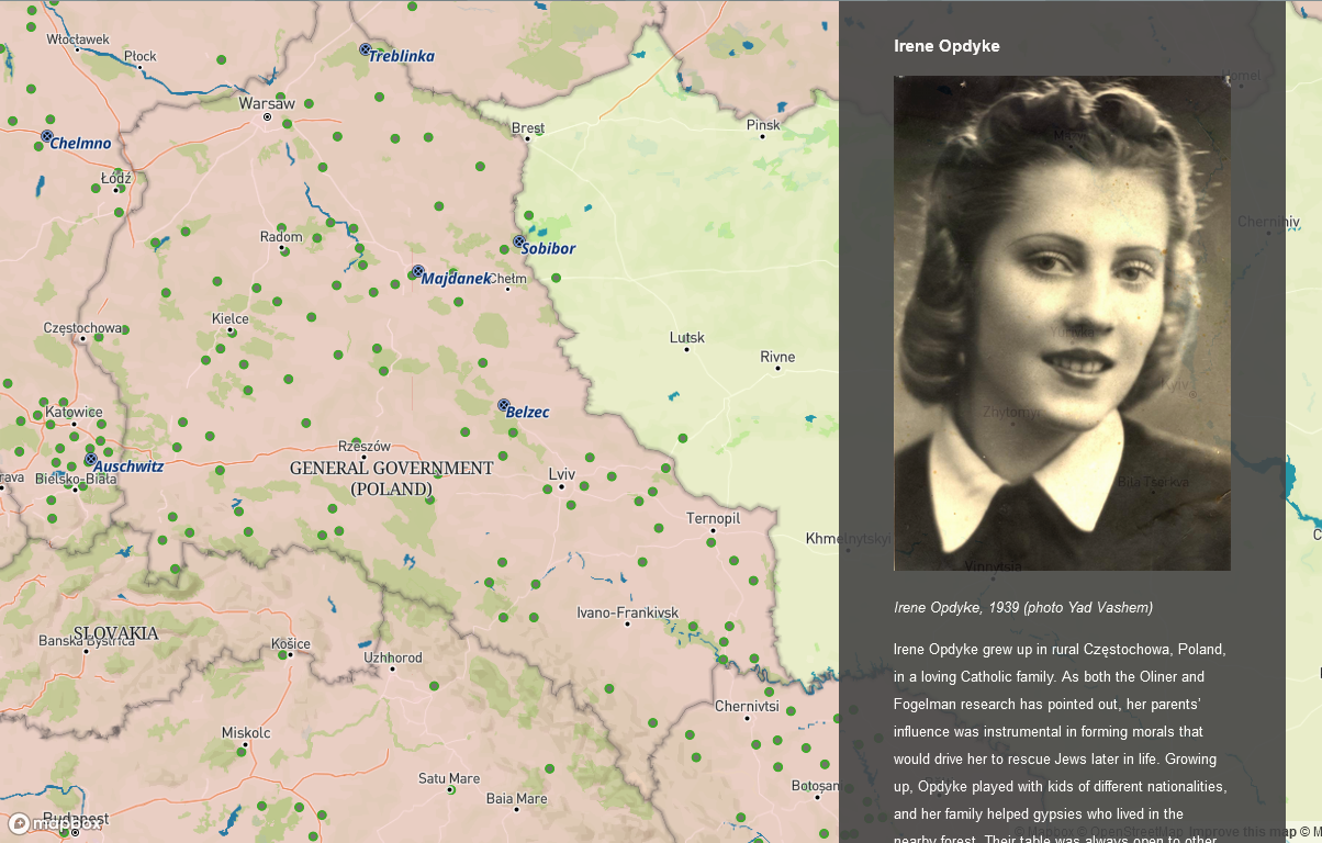
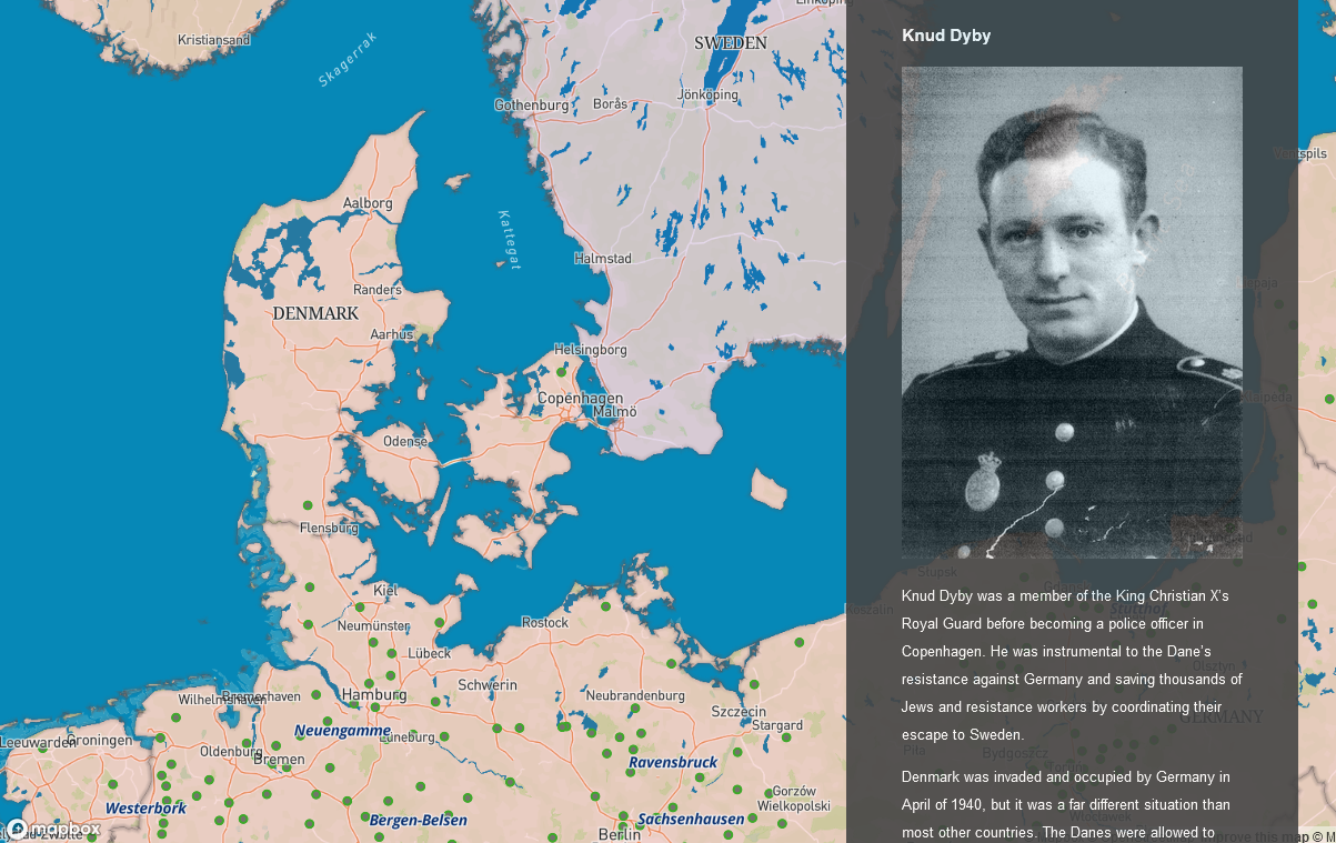
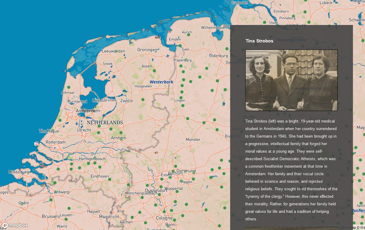
I believe that maps are so important to provide a sense of place, especially as our highly plugged-in world gives us less and less geographic awareness. Geography is about culture, and understanding that sense of place opens us up to what might be happening beyond our insulated world. In graduate school (the second time!) I made a point to insert maps into any project that would benefit from this sense of place. My Holocaust Rescuers project was a perfect scenario to provide the reader with interactive maps to show the perilous state of Nazi occupation in World War II Europe.

In my spare time, I get my creative kicks designing cartographic cycling maps and playing with interactive website maps and video maps. It's been a very fun creative process to create maps for my friends and family, as well as to keep the brain fresh with new technology.

WebsiteIndexCompassPageBackground2.png

 Cartographic maps

I have been using the open source GIS software, QGIS, since around 2015. It began as an alternative to the license-heavy and expensive ESRI that every map maker cuts their teeth with at some point. Whether doing simple work tasks at home or playing with personal map projects on the weekend, QGIS was a perfect solution and it often outshined ArcThisNThat. QGIS has served as the backbone for many desktop cartographic projects as well as managing geographic data that I use in other applications (see below). It's a phenomenal resource for basic data viewing, data analysis, or full on cartography, and their community is brilliant and welcoming.

Cycling Route Maps and Atlases

I really dug into the power of QGIS when I began creating cartographic cycling maps of Lake Como, Italy, in 2015. At the time, there were no good cycling maps of the area (at least IMHO) so I rolled up my sleeves and created my own. I also taught myself how to create elevation profiles of the routes using Excel, which was a huge revelation because they’re one of the first pieces of information that cyclists always go to. The maps show the route, notable stops along the way, elevation, distance, and percent grade of climbs and descents. Although these are pretty, they were not used very much other than general reference because most people went out with a guide or used a GPX. Stubbornly, I still find value in reviewing maps!

These large atlas of cycling routes were used at the cycling hotel, Il Perlo Panorama, and were an extremely helpful tool for staff and guests to know the area. The first map below is the 2016 version, which was limited to the routes I'd done, and then the second map was the updated 2017 version with all the ComoLagoBike cycling routes around the lake and nearby mountains, including a few amazing mountain bike routes. The final atlas that was printed as a foldable, paper guide showed 20 cycling routes at easy, medium, hard, and difficult levels. Each level was color coded for easy interpretation, as well as numbered to correspond with the legend. Major passes and towns were labeled, and the local lauriosaurus also made an appearance! In May 2017 I was I was honored to be invited to speak about this cycling atlas project and methods at the CUGOS (Cascadia Users of Open Geospatial Open Source) Spring Fling.

Pittsburgh Cycling Atlas

My dad is a founding member of the Mt. Lebanon Cycling and Caffeine Club. For Father’s Day one year, I made him a map of his favorite Pittsburgh cycling routes that included special features around town: The Pink Pony, their standard coffee stops, the zoo’s elephant, the sports stadium that often has early morning tailgaters, and many of the city’s bridges. He ended up having a local frame shop print it on an aluminum sheet to give it a shimmery metallic look. Perfect for the Steel City!

Maps of South Park Trails

For my Graphic Design class, we had to create a marketing book using Adobe InDesign. My project was of the mountain bike trails in South Park, PA, and of course I had to incorporate maps.

Data sources for these projects: MapBox, OpenStreetMap, ComoLagoBike, ESRI, Noun Project, Allegheny County GIS

Interactive website maps

Many people don’t know the name Mapbox, but they definitely use it in many of their daily tools and apps: Strava, National Geographic, the New York Times, CNN and more. It is a San Francisco-based company that provides developer tools for online and mobile mapping applications. You can think of them as the everyday person’s alternative to Google, and IMO they are leagues more useful, especially to the single, low budget user like myself who enjoys managing their own data and using the same tools as the big businesses.

Mapbox Studio

Mapbox Studio makes designing an online map so easy and intuitive. You can choose from an array of pre-designed map templates with nearly every cartographic feature you could want. The Mapbox cartographers have already set up the labels and symbology. Upload your own data, tweak some of the settings (3-D imagery anyone?) and your custom map is ready to embed and shine.

The map below was made for a story I wrote about my friends’ 800-mile bike tour from Vermont to Pittsburgh. You can zoom around, and using the CTRL or CMD key, it will change the map angle and show the 3-D imagery. For example, zoom into Lake Placid in northeastern New York state. Hold the CTRL or CMD key while panning with your mouse and the Adirondack mountains pop up. No wonder they were complaining about the endless climb!

Map Stories

I’m a big fan of giving a user multiple ways of learning a story: written content, maps, photos, and videos. The Mapbox interactive Map Stories do just this. You can customize it with a map you’ve made in Mapbox Studio, then edit the javascript file to add the other elements. I’m not a programmer and just needed a little HTML knowledge to create these four Map Stories for my Holocaust Rescuer project. I discuss the data I used and created for these Map Stories on my project Map Data Sources page.

Italy Rescuer Map Story

Featuring Gino Bartali, the cycling champion of Italy, and the Assisi Network

Poland Rescuer Map Story

Featuring Jan Karski, the Polish Underground spy, and Irene Updyke, the independent laundress working at a Nazi headquarters

Denmark Rescuer Map Story

Featuring policeman Knud Dyby and the citizens of Denmark

Netherlands Rescuer Map Story

Featuring Tina Strobos, the Socialist-Democratic-Atheist, and the Dutch Underground

 
WebsiteIndexCompassPageBackground2.png

video maps 

I’ve been known to be a little competitive when I see another map person doing something really cool! It lights a small fire that makes me want to learn how they did it, too. The past year or so has seen a real increase in animated maps used in videos particularly with 3-D satellite imagery. I remember seeing animated maps used to show each stage in the 2021 Tour de France, they were so well done! Simple cartography, but with a 3-D element to show the scale of the mountains and distance the racers would ride. The 2020 Olympics (well, delayed to 2021) also featured very well-made maps for their events, and then I noticed that GCN+ documentaries were creating fantastic animated route maps as well. I was determined to figure out how they were made. They aren’t many software options to create these types of maps, so my research didn’t take long to discover these two options:

Adobe After Effects + GeoLayers

Probably the most popular is the After Effects extension call GeoLayers. It’s around $300 and has an incredibly steep learning curve. I’ve devoted hours and hours and hours watching the limited videos demonstrating how to use it. Is it powerful? Yes. Is it easy to use? Heck no, but I keep plugging away at it and have an enormous amount of respect for the skills and time devoted to making really good animated maps.

This animated map was created for the beginning of our club’s Bike MS video.

This is a draft video of a bike trip my friends made from Vermont to Pittsburgh. Some of these elements are cringable so I hope I can improve!

Google Earth Studio

Sometimes I harp on Google, but they have done a smashing job with the 3-D imagery in Google Earth Studio. Not all areas of the world are covered, it’s mostly urban areas and some popular mountain ranges, but where it is complete - WOW - it’s just stunning. The tool has some simple presets to fly to a location (used below), or the map’s movements can be customized, which takes a lot more experience and patience.